Calling all entrepreneurs, bloggers and business owners... we're continuing the discussion on getting a better bio photo.
Last time I told you why it's IMPORTANT to have a good bio pic of yourself. Now we're going to start going a little deeper to show you how to make it happen.
How to Get a Good Bio Photo // Part Two: Incorporating Your Message
First of all, let's agree that your website/blog/social media and branding (in general) are all working together to send a message of some sort to the people that view it/use it/interact with it. The better you know who your target market is, and the better you know yourself (how you'd like your target market to see you), the more customized of a message you can create with your bio pic.
---------------------------------------------------------
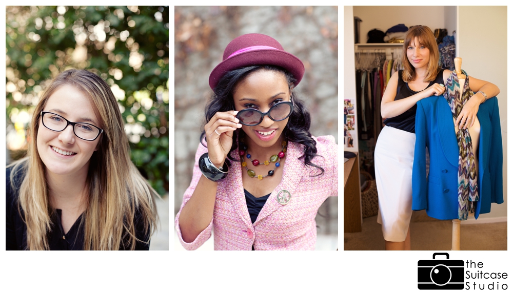
Example one: you've got a blog filled with outings and crafts for the family, a mix of sponsored posts and ones of your own creation; your target market is made up of mothers in their early 30s who are the primary caregiver of the kids (whether they be SAHMs or work part-time or full-time), and your message might be something along the lines of "I'm a mom of 3, balancing work and motherhood just like you, and am here to offer a round-up of fun and family-friendly activities so you have one less thing to stress about in keeping the kids (or yourself) entertained." With this in mind, you'd want to make sure your bio photo makes you appear friendly and casual (for example, through more casual dress/hairstyle, big smile or laugh, tilted body or head, and "movement" in body language).
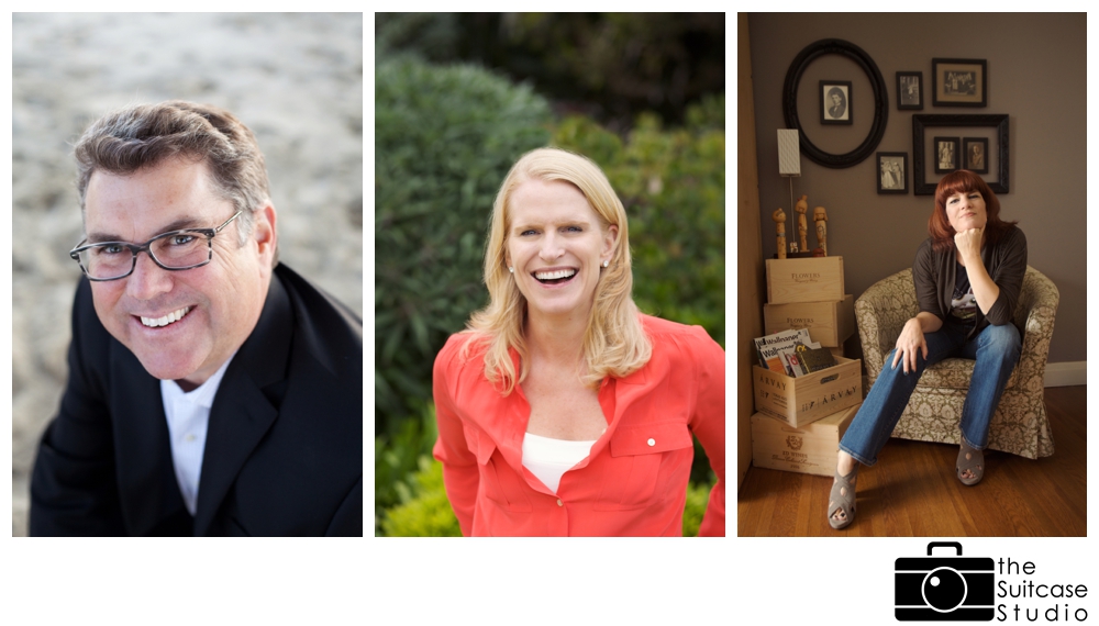
 Example two: you're an accountant charging $425/hour; your target market is a mix of men and women in their early 50s who own their own businesses. The message you might want to get across is something like "I'm confident, reliable and fantastic at what I do; put your faith in me and I will take care of everything for you." With this in mind, the photo would be a bit more on the serious side (for example, through a dressier outfit, calm body language, and making strong eye contact with the camera).
 Now, that's not to say that the person in example one doesn't have a serious side, and the person in example two doesn't laugh and play.
But the anatomy of a "good" photograph is different than the psychological structure of one.
What this means: Your bio photo should not only be a good photo of yourself, it should also mirror the message you want to send to your clients.
Not quite sure what your "message" should be? Try these quick exercises to figure it out:
- List 3 words to describe your target market.
- List 3 words to describe your business.
- List 3 ways your business is unique.
- List 3 words to describe yourself, as you'd like your target market to see you.
Once done, look for patterns and select the strongest words, or the ones that resonate with you most. Ta-Da! You have your "message."
Using myself as an example... the 3 words I keep in mind for all of my own branding/marketing: FUN, PERSONAL, and STRESS-FREE.
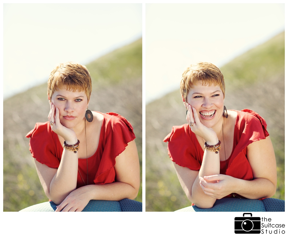
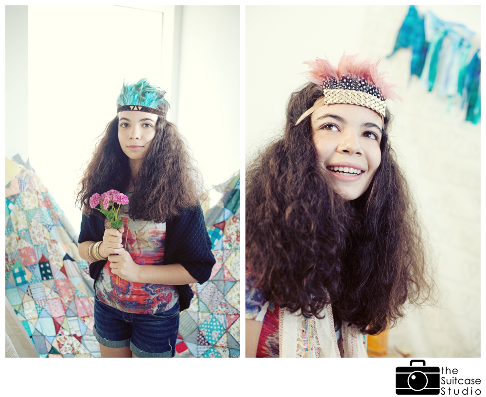
Now, keeping those three words in mind... look at the two pictures below.

I personally looooooooove the image on the left. Not to sound conceited, but I think it's a great picture of myself. My hair is perfectly in place, my skin is smooth, my eyebrows and eye makeup look great, and the look in my eyes is a bit smoldering. Yeah... I rock.
As a comparison... I'm not quite as "pretty" in the picture on the right. I see my flaws a bit more: my eyes always "disappear" when I laugh, my face gets wider, my nose flares a bit, and my top lip pulls waaaaay up to expose a lot of gum above my teeth.
But... most people would NOT have noticed all the little details I just pointed out. Instead, most people are drawn to the PERSONALITY that is exuded in the picture on the right. It's JOYFUL. I'm not only smiling, but LAUGHING. My pose isn't stagnant but is in motion. I'm looking away from the camera, which is always a bit more playful of a pose (and in another psychological ploy, I'm looking towards the right which actually draws the eye in that direction). And, as lovely as it is, the same emotions do NOT apply to the image on the left.
And so, as you might have noticed, I've been using the image on the right as my bio pic. Because even though it's not the most beautiful picture, it is perfectly aligned with my brand: FUN, PERSONAL and STRESS-FREE.
Make sense? Now it's YOUR turn.
----------------------------
Need a bit of help to get started, or would love for ME to snap your new bio picture? YOU'RE IN LUCK!
Business Casual MINI-SESSIONS are available on February 22 and 23
Registration is now officially OPEN, and space is extremely limited. So be sure to click here to save your spot!

And stay tuned for part 3 in this series, when we talk about location and lighting.




 Now, that's not to say that the person in example one doesn't have a serious side, and the person in example two doesn't laugh and play.